CSS 常用語法

1. 基本的常用語法
超連結的連結樣式
a   加入所有超連結樣式
a:link   加入超連結文字樣式
a:hover   加入滑鼠指標指著連結樣式
a:active   加入按下啟用連結的樣式
文字風格樣式 CSS文字風格樣式範例
color: #0f0f0f;   文字顏色
font-family: Arial, Tahoma;   文字風格字型
font-size: 13px;   文字大小
font-weight: bold;   文字粗體
font-style: italic;   文字斜體
font-variant: small-caps;   小字體
letter-spacing: 1px;   字體間距離
line-height: 18px;   設定行高


text-decoration: line-through;   加上刪除線
text-decoration: underline;   加上底線
text-decoration: none;   刪除連結底線
text-transform: capitalize;   字首大寫
text-transform: uppercase;   英文大寫
text-transform: lowercase;   英文小寫


text-align: right;   文字靠右對齊
text-align: left;   文字靠左對齊
text-align: center;   文字置中對齊
text-align: justify;   文字分散對齊


vertical-align: sub;   下標字
vertical-align: super;   上標字
vertical-align: top;   垂直向上對齊
vertical-align: bottom;   垂直向下對齊
vertical-align: middle;   垂直置中對齊
vertical-align: text-top;   文字垂直向上對齊
vertical-align: text-bottom;   文字垂直向下對齊


word-spacing: 5px;   設定詞的間距(詞間需有空白)
word-wrap: break-word;   任意斷字,適用於英文
word-wrap: nowrap;   強制水平排序不斷行
文字風格樣式 CSS項目樣式範例
list-style-type: none;  沒有標誌,不編號
list-style-type: disc;  實心圓形符號
list-style-type: circle;   空心圓形符號
list-style-type: square;   實心方形符號
list-style-type: decimal;   阿拉伯數字
list-style-type: decimal-leading-zero;   阿拉伯數字(十進制前置零)
list-style-type: lower-roman;   小寫羅馬數字
list-style-type: upper-roman;   大寫羅馬數字
list-style-type: lower-alpha;   小寫英文字母
list-style-type: upper-alpha;   大寫英文字母
list-style-type: lower-greek;   希臘語
list-style-type: armenian;   亞美尼亞
list-style-type: georgian;   格魯吉亞語
list-style-image: url(dot.gif);   圖片式符號
list-style-position: outside;   凸排(預設值)
list-style-position: inside;   縮排
背景樣式 CSS背景樣式範例
background-color: #5f5f5f;   背景色彩
background: transparent;   透明背景
background-image : url(bg.gif);   背景圖片
background-attachment : fixed;   浮水印固定背景
background-repeat : repeat;   重複排列-網頁預設
background-repeat : no-repeat;   不重複排列
background-repeat : repeat-x;   在 X 軸重複排列
background-repeat : repeat-y;   在 Y 軸重複排列
background-position : 90% 90%;   背景圖片 X 與 Y 軸的位置
background-position : top;   向上對齊
background-position : bottom;   向下對齊
background-position : left;   向左對齊
background-position : right;   向右對齊
background-position : center;   置中對齊
指定滑鼠游標的型態 CSS滑鼠樣式範例
cursor: move;   十字箭頭
cursor: help;   協助加一問號
cursor: wait;   等待中;漏斗
cursor: pointer;   手型,表示超連結
cursor: not-allowed;   無法使用
2. CSS元素邊界關係:border、padding 、 margin
剛開始學還被padding跟margin搞得滿亂的~
border很簡單就是邊框
<div class="box">hello world</div>

<style type="text/css">
	.box{
		height: 300px; /*設定高度300px*/
		width: 300px; /*設定寬度300px*/
		border: 1px solid black; /*設定邊框為 : 粗度為1px solid為實體線 black為黑色*/
	}
</style>
圖示 :

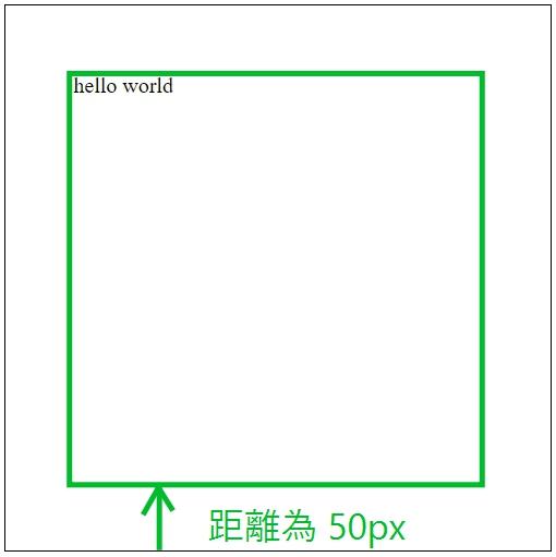
margin 為 外距 : 向外的距離
<div class="box">hello world</div>

<style type="text/css">
	.box{
		height: 300px;/*設定高度300px*/
		width: 300px;/*設定寬度300px*/
		border: 1px solid black;/*設定邊框為 : 粗度為1px solid為實體線 black為黑色*/
		margin: 50px;/*設定外距 : 50px*/
	}
</style>
說明 : 就是邊框往外的距離增加50px
圖示:

padding 為 內距 : 向內的距離
<div class="box">hello world</div>

<style type="text/css">
	.box{
		height: 300px;/*設定高度300px*/
		width: 300px;/*設定寬度300px*/
		border: 1px solid black;/*設定邊框為 : 粗度為1px solid為實體線 black為黑色*/
		margin: 50px;/*設定外距 : 50px*/
		padding: 50px;/*設定內距 : 50px*/
	}
</style>
說明 : 就是邊框往內的距離增加50px
圖示 :
3. Position 物件定位
static:
這是原本的預設值,套用這個語法,將不會被特別被定位在某地方,而是照著瀏覽器原本的位置。
*relative:
基本上,如果這與法沒有特定設定top、right、bottom、left來定義他的位置
那他也是照著瀏覽器原本的位置。
*absolute:
這是在做網頁設計時,很廣泛被使用的語法,通常會和relative一起使用
這語法會在除了static以外的第一個父元素定位
通常會用在圖片做遮罩,或是寫文字使用
fixed:
這是在瀏覽器的畫面做定位
是在做網頁的浮動區塊使用,可以設定top、right、bottom、left來定義他的位置
4. 進階排版 display: flex
display: flex
block element 的 display 值預設為 block,因此三個小方塊-紅、藍、綠皆呈現一直行排三列狀態。

html
<div class="container">
  <div class="item red"></div>
  <div class="item blue"></div>
  <div class="item green"></div>
</div>
css
.container {
  display: block;
}
.item {
  width: 50px;
  height: 50px;
  margin: 10px;
}
.red {
  background: red;
}
.blue {
  background: blue;
}
.green {
  background: green;
}
若將父元素 container 改為 display: flex,則會呈現一橫列狀態。
.container {
  display: flex;
}
justisfy-content
- flex-start
- flex-end
- center
- space-between
flex-start 靠左對齊

.container {
    display: flex;
    justify-content: flex-start;
}
flex-end 靠右對齊

.container {
    display: flex;
    justify-content: flex-end;
}
center 置中對齊

.container {
    display: flex;
    justify-content: center;
}
space-between

.container {
    display: flex;
    justify-content: space-between;
}
align-content
- flex-start
- flex-end
- center
- space-between
每行貼齊交錯軸線最前端

align-content: flex-start
每行貼齊交錯軸線最末端

align-content: flex-end
每行對齊交錯軸線中間

align-content: center
第一行與最後一行分別對齊交錯軸線最前端與最末端

align-content: space-between
每行平均分配每行間距

align-content: space-around
預設值,每行內容元素全部撐開至 flexbox 大小

align-content: stretch
5. @media screen 說明教學
響應式網頁設計(Responsive Web Design)簡稱RWD,又稱適應性網頁、響應式網頁設計、回應式網頁設計、多螢網頁設計,這是一項開始於2011年由Ethan Marcotte 發明的術語 Responsive Web Design (RWD)。
2012年後被公認為是日後網頁設計開發技術的趨勢,網站使用CSS3,以百分比的方式以及彈性的畫面設計,在不同解析度下改變網頁頁面的佈局排版,讓不同的設備都可以正常瀏覽同一網站,如電腦、平板、手機、電視都能夠得到最佳的預覽視覺效果,是個因移動平台的用戶大量增加而想出的一個對應方法,也是愛貝斯擅長的網頁設計技術之一。
Max Width
若瀏覽區域的寬度小於600像素,則下方的CSS描述就會立即被套用:
@media screen and (max-width: 600px){
    .class{
        background: #ccc;
    }
}
記憶技巧 : 看到 max 就記得 (以下) ,上述範例 : 600px以下背景顏色改變成#ccc
Min Width
若瀏覽區域的寬度大於900像素,則下方的CSS描述就會立即被套用:
@media screen and (min-width: 900px) {
    .class {
	    background: #666;
	}
}
記憶技巧 : 看到 min 就記得 (以上) ,上述範例 : 900px以上背景顏色改變成#666
min-width and max-width
瀏覽區域寬度範圍在321px~768px,則下方CSS描述會立即被套用:
@media only screen and (min-width: 321px) and (max-width: 768px) {
	.class {
		background: #666;
	}
}
參考網址 :
https://coolong124220.nidbox.com/diary/read/9959355
https://cythilya.github.io/2017/04/04/flexbox-basics/

留言
張貼留言